A basic rule of thumb in conventional navigation is if you know where north is, you can figure out east, west and south. Similarly, if you always keep the navigation bar visible on your ecommerce site, it’s a lot easier for customers to find their way around and locate products quickly. This is why you should use sticky navigation in ecommerce.
What is it Exactly?
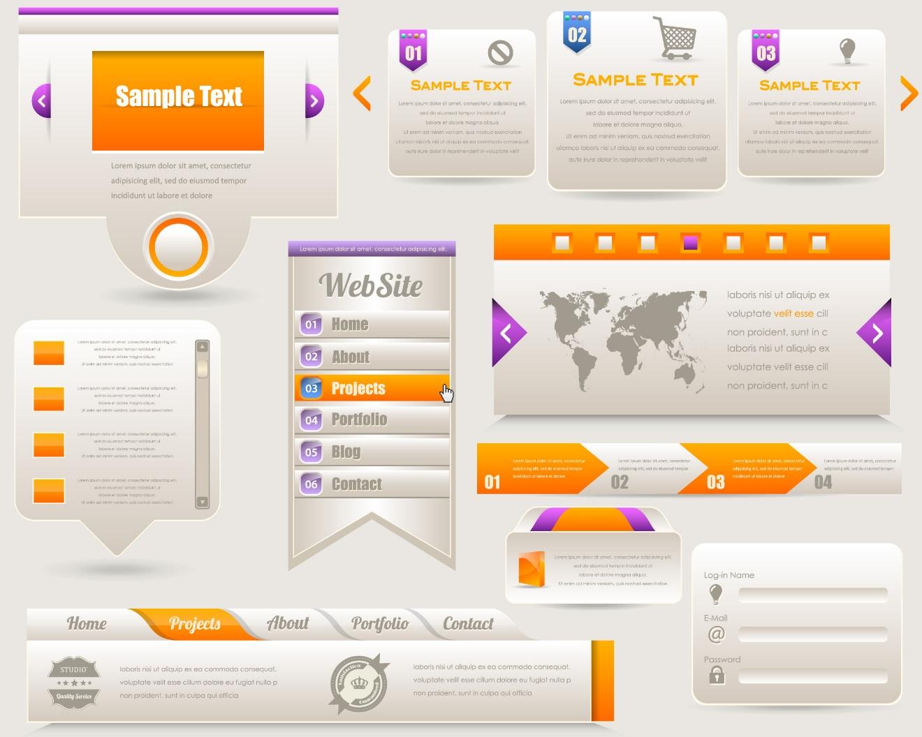
The term describes a fixed navigation bar which remains visible regardless of where the user goes on the site, or how they scroll. While some experts feel they are a distraction, others believe the benefit they provide overrides the potential for distraction.
Users Like It
Actionable websites (such as eCommerce stores) can really benefit from the use of sticky navigation. In fact, it has been proven to provide a much better customer experience by helping shoppers remain better oriented. Users also tend to feel it gives them more control over the shopping encounter. On average, sticky menus are some 22 percent quicker to navigate. This means if a user is spending five minutes on your site, they’re using 36 seconds less to look for things, which can equate to 36 more seconds considering it and buying it.
It’s A Godsend for Long Pages
If yours is a product heavy site, users could be well down into the page looking for a particular item. If they then have to scroll all the way back to the top of the site every time they want to consider a different category, that’s going to get old pretty quickly. The best free website templates provide users ready access to the navigation bar at all times. Further, consumers are willing to wander more deeply into a long page of items when they know they get out easily because the navigation bar is always there for them to access.
Appeals to Older and Newbie Shoppers
Older adults and younger first-time users tend to respond better to sites with sticky navigation. These are people whose confidence levels are lower than that of power users who intuitively find their way through any circumstance. Having the menu bar always there gives them a measure of reassurance. They know exactly what options are open to them, which in turn helps them feel more in control of the situation. Comfortable shoppers are more likely to be buyers, so give the people what they want.
To Get The Most From Sticky Menus
Half hiding the search will make your navbar consume less space on the screen. However, you should only employ this tactic in desktop environments. Smaller mobile screens could make an abbreviated search function easy to miss because it’s partially hidden. Still, though, power users might find a sticky menu annoying. To appease them make the nav menu collapsible so they can eliminate it if they’d rather not see it. If you’re coding your site rather than using a template, pay strict attention to the menu’s position, margin-top and z-index. You’ll also want to avoid the IFrame shortcut because it could compromise the look of your site on certain browsers and devices.
Using sticky navigation presents a number of real benefits for ecommerce sites. They reassure your customers, make product categories easier to locate and speed the shopping process. And hey, anything that moves shoppers to conversion more quickly has to be a good thing – right? If you’re going back and forth over the usefulness of sticky menus for your situation, set them up to be collapsible. This gives you the benefit of having the feature without forcing every one of your shoppers to live with it. It’s truly the best of both worlds.

