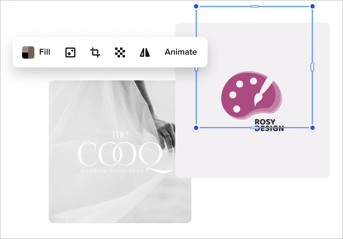
Your logo is what makes your business recognizable. It’s what people think of when they hear your brand name.
Believe it or not, your logo can significantly impact your success as a business. If you have a poor logo that doesn’t reflect your brand or appeal to your audience, they’re less likely to take a look at your offerings.
On the other hand, if your logo is eye-catching and intriguing, you can more easily build a strong reputation for your brand and boost your success. So, no matter what industry you’re in, creating a great logo is vital to your success.
When designing your company logo, there are a few key factors that you need to keep in mind. You can’t just design any old logo and hope for the best!
Top Tips to Consider for Logo Design
If you’re not sure what to consider when creating your logo, here are some top tips to help you. These tips will help whether you’re designing an ideal logo for your Instagram store, online business, or brick-and-mortar shop.
Use An Online Logo Designer

Gone are the days when you need to design everything by hand. There are now plenty of great online logo design tools that are simple and easy to use.
Using an Online Art Logo Maker, you can create the perfect logo for your brand without requiring a background in art and design. You can try different shapes, colors, and sizes to see what looks the best before you finalize your design.
Consider Color Psychology

When choosing your color palette, consider color psychology. People respond differently to certain colors, so the colors you use in your logo affect how your brand is perceived.
For example, red and yellow colors are often used in food companies’ logos because they are known to make you hungry. White is associated with trustworthiness, loyalty, and professionalism.
Consider your brand values and which colors best align with these values. Use a maximum of three different colors in your logo to keep it memorable and effective.
Don’t Be Afraid of Empty Space
Many people make the mistake of thinking they need to fill every space in their logo with color or font. But a little bit of empty space goes a long way.
Keeping a small area of your logo blank helps to keep it neat and clean. It reflects your professionalism as a brand and makes your logo more appealing to the masses.
Be Literal

You might want to do something crazy and intricate for your logo but, most of the time, being literal is more favorable. Don’t be afraid to make it obvious. The quicker people recognize what’s on your logo, the quicker they will know exactly what your business offers. The Apple logo is a great example of this.
Being literal could also include using an image of the main product that you sell. Including a graphic makes your brand more recognizable across the world by people who speak all languages. It removes the difficulties of translating the name of your brand into other languages and creates a uniform sign that everybody can recognize.
Consider Minimalism
Simplicity goes a long way when you are designing a logo. Adding too many finer details can make your logo cluttered and unprofessional.
Most people will miss the smaller details when they are scrolling past your logo on social media or looking at your business card anyway. So, there is very little use in wasting time and resources trying to design something extremely artistic and intricate.
When creating your brand logo, stick to something minimalistic. The most successful brands of those with single-colored or bitonal logos.
Test the Logo On Different Mediums
Your logo represents your brand in every aspect. It should look appropriate and professional on every possible medium, including online websites, social media posts, and physical promotional tools, such as business cards and brochures.
Make sure to test your logo on each of these mediums before you settle on a final design. It should look good in every form to ensure consistency and recognition.
We hope these tips come in handy while designing your logo.


