YouTube is a video streaming platform owned by Alphabet, aka Google, that is a free-to-use platform for content creators and viewers alike. It’s a place for people to connect with each other, watch people go about their daily lives, provide DIY tutorials, or share their latest discoveries. In that vein, many people earn supplemental income or make their living outright by providing content on YouTube.
The most-subscribed YouTube channel is T-Series, a music channel from India with 221 million subscribers, but you may be more familiar with PewDiePie, which has 111 million subscribers. It’s a lot of work to build up your own subscriber base on YouTube. But you can find yourself with a comfortable following when you put in the effort, including creating a recognizable logo for yourself.
5 Logo Design Tips For YouTube Channel
Your logo is your brand identifier and you can make one for your YouTube channel. Applying good design practices in the creation of your logo helps you create something that represents you and your brand. Let’s look at the aspects you should consider when designing your logo so it’s effective and recognizable.
1. Learn about your niche best practices
YouTube is full of niches that adopt a common style for their logos. For example, automotive YouTubers like to use bold fonts and colors, while music creators tend to gravitate towards fonts that represent the era of music they release. The goal of a logo is to make it easy for a viewer to identify the content creator, their niche, and the overall feel of the channel.
Here’s a breakdown of specific types of logos for different niches:

Surface, a gaming channel, uses a two-color logo that’s simple, clean, yet aggressive. The use of the stylized skull with spikes and a font that echoes the skull in terms of a spiky appearance informs the viewer that this is a channel related to gaming. Little effort is needed to identify the content and it’s quickly associated with the content creator when viewed.

The logo for Pure Beauty, a beauty channel that provides tips for skincare and makeup, uses soft, sweeping swatches of pink and ruby colors to indicate that the channel is put out by a beautuber. The white of the font stands out clearly and is clean and crisp. Overall, it fits into the overall aesthetic of the niche.
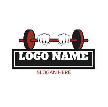
The logo for the fitness niche is bold, clean, and uses visual language in the form of two fists gripping a barbell that leaves you in no doubt as to the content of the channel. It relies on using white as a highlight, solid black for lines and blocking, and red to highlight the barbell and font. This is a good example of using three colors (two if you don’t consider white to be a color) to delineate the logo.
2. Choose a type of logo
You have options when it comes to the type of logo you want to use for your YouTube channel. They include a monogram, icon, wordmark, combination of elements, or an emblem. Remember that the type of logo you select is going to be associated with your channel and eventually become your identifier.
Icon – An icon is an image that relates to the type of content you create, such as a tool or item that’s associated with your niche.
Wordmark – The wordmark is the name of your channel in a stylized font and in a color of your choice but has no other inclusions.
Monogram – The first letter or letters of your channel name, laid out in a stylized font and color.
Emblem – The emblem is similar to the icon, but typically incorporates the name of your channel into a drawing or stylized image.
Combination of elements – This involves combining two or more of the above elements into the design of your logo.
3. Don’t use more than three colors
You might be asking why you should restrict yourself to three main colors when you’ve probably seen YouTube logos that use multiple colors. The main reason for using three colors comes down to the fact that a YouTube logo is small and easily overwhelmed by the use of too much color. In fact, the YouTube logo itself uses three colors: black, red, and white, which shows the strength of sticking to this rule.
![]()
The rule of three colors isn’t necessarily a hard one. You can take one of your three colors and use a different tone or shade as long as it’s derived from one of the main colors. Using a darker shade can help your logo text pop out and be visible to the viewer.
Still not convinced that you don’t need more than three colors in your logo? Take a look at major YouTube channels and look at their logos. You’ll find that channels using text for their logos are adhering to the three colors maximum rule. The same is true in the brick-and-mortar world with retailers using two or three colors for their store’s color schemes. It’s a formula that works and makes it easier for people to see your logo.
4. Think about scale
Scale is important when it comes to the overall size of your logo. In this instance, scale refers to the final image and not the size of the original logo as you can scale it down. Rather, scale refers to balancing the elements, making sure the font is readable and doesn’t overwhelm your graphic image. You want your final logo to be small, yet readable or recognizable.
The main purpose of keeping your design small comes down to the fact that people are looking at YouTube on a small screen. The same is true on a computer monitor because YouTube serves up multiple videos on its landing page. A user sees a variety of videos from different types of content creators with the logo next to the name of the channel. You don’t want to overwhelm that space with a large and busy image.
You’re better off saving a large logo for the opening screen of your video or website as you want to draw in your viewer quickly. You have a lot of competition for viewers, and you’re more likely to draw someone in with a clean, simple logo. The viewer spends less time identifying the content of your channel and is more likely to click on your channel.
5. Keep it simple
You may be tempted to put a lot of effort into creating a YouTube logo that reflects your personality. There’s nothing wrong with that desire, but you’re better off putting that energy into your content creation. Don’t go overboard with your logo creation, keep the fonts simple but representative, and pick colors that make your logo pop.
![]()
Make multiple versions of your logo before you settle on one that works. Shrink them down to size to get a feel of how they’ll read, ask people for opinions, and use the logo that feels right to you. You can always change it if you don’t like what’s up there. But eventually, you’ll want to stick with the same logo for consistency and make it easier for viewers to find you.
Final Words
Your YouTube logo is a static image that conveys a lot of information about your channel through imagery and text. These design tips should help you create a logo that is pleasing to the eye, represents the type of content you create, and helps viewers identify your channel. Taking the time to create a simple, yet effective logo is rewarding, especially as your channel grows and new opportunities come your way.
RELATED TIPS:
- Factors to Consider When Designing a Logo for Your Business
- How to Create An Ideal Logo for Your Instagram Store


